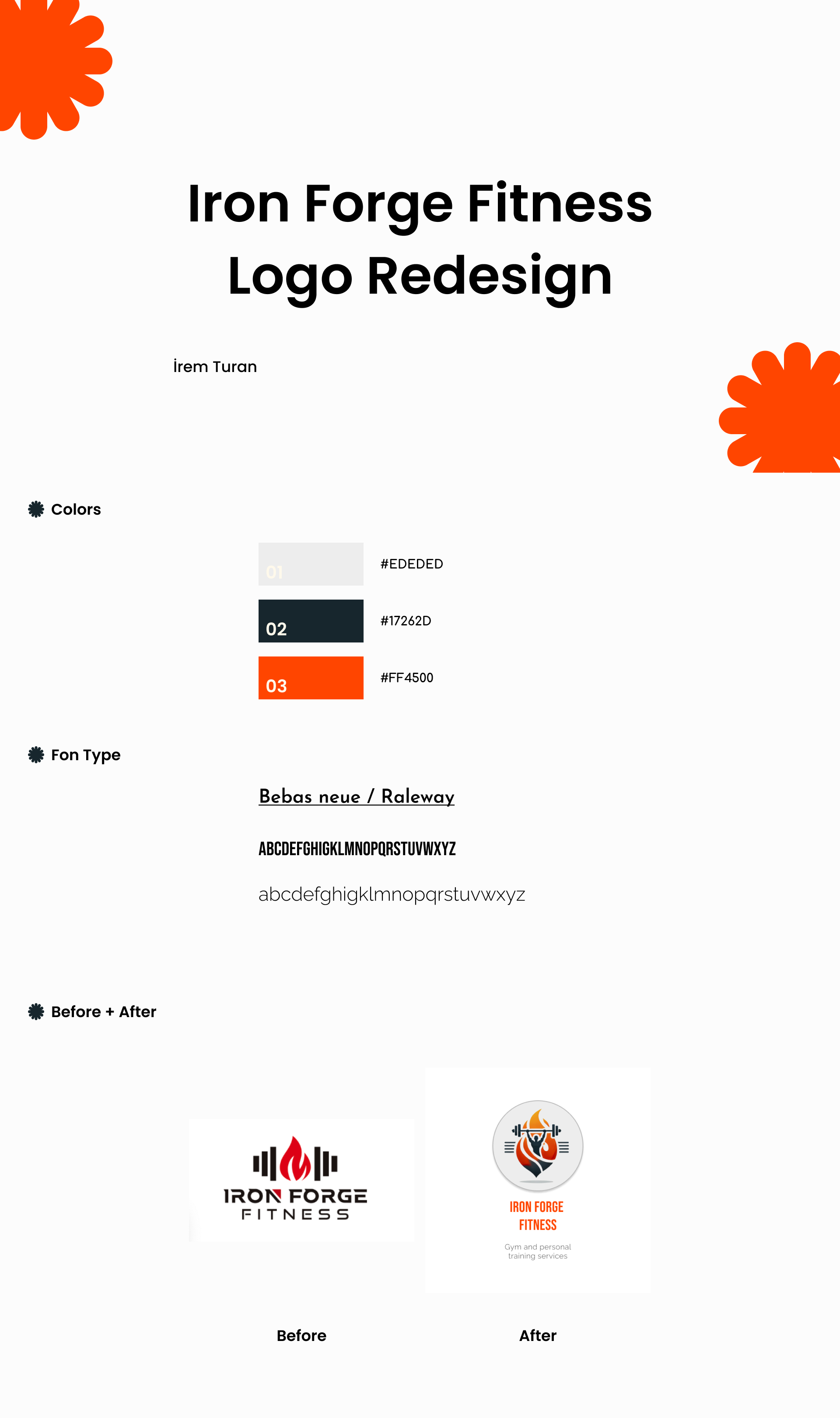
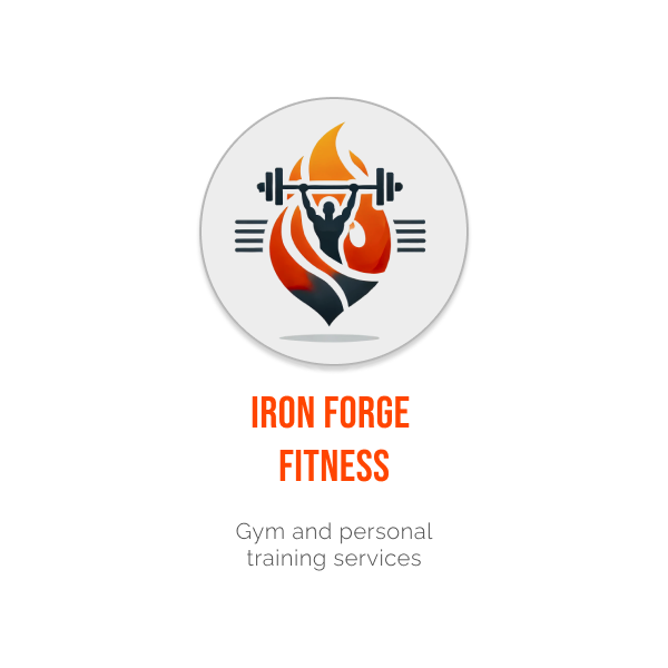
Iron Forge Fitness Logo Revamp
Impressive logo design combining power and dynamism with flame.
With the flame and the barbell figure, a dynamic design was created that directly reflects the concept of both strength and fitness. The orange and gray colors symbolize energy and industrial robustness. The rounded form of the logo enhances visual balance and professionalism.
Improvements
Added visual figures reflecting the fitness theme.
Energy and motivation were emphasized with the flame figure.
A strong and dynamic brand perception was created with the color palette.
The typography was modernized and given a strong look.
The logo form was adjusted to increase the overall balance of the design.
Energy and motivation were emphasized with the flame figure.
A strong and dynamic brand perception was created with the color palette.
The typography was modernized and given a strong look.
The logo form was adjusted to increase the overall balance of the design.