Kohaku – Logo & Brand Identity for a Jewelry Brand
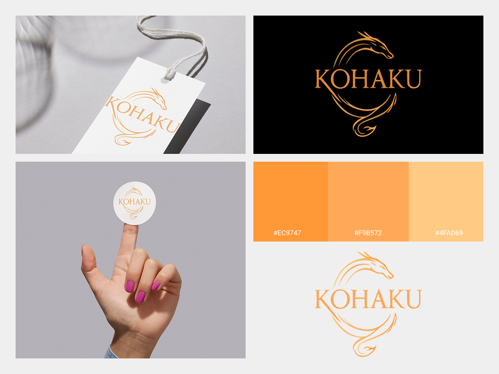
Kohaku is a jewelry brand inspired by the mythical dragons of East Asia—symbols of elegance and power.
This project focuses on building a refined and symbolic visual identity that reflects the brand’s soul.
This project focuses on building a refined and symbolic visual identity that reflects the brand’s soul.
The logo blends the dragon's shape into a circular "C", forming a subtle yet meaningful icon.
Typography features a classic serif font, highlighting heritage and luxury. The color palette includes shimmering gradients to convey sophistication. Variations ensure usability across different backgrounds and materials.
Typography features a classic serif font, highlighting heritage and luxury. The color palette includes shimmering gradients to convey sophistication. Variations ensure usability across different backgrounds and materials.
Project Deliverables:
Primary logo & monogram
Light/Dark background adaptations
Color palette
Mockups (tag, sticker, brand applications)