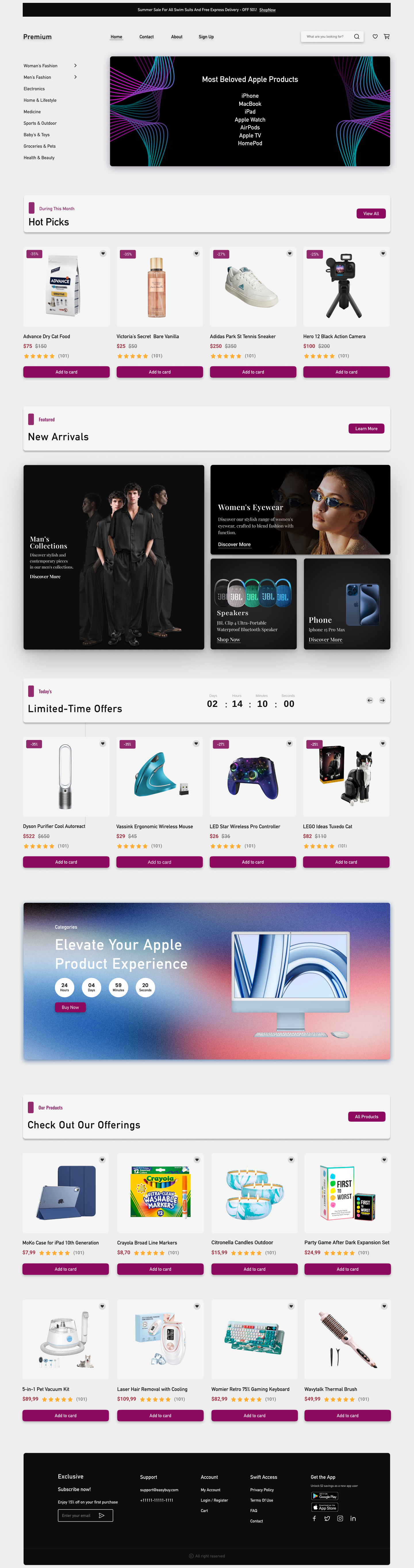
E-commerce Website Homepage Design
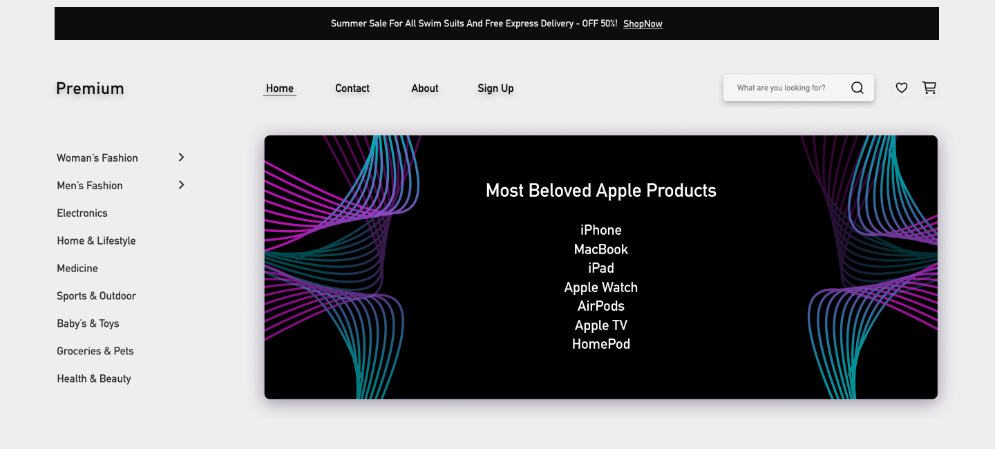
Section 1: Main Header and Navigation
As a new UI/UX designer, one of my top priorities was ensuring that users can easily navigate the e-commerce site upon entry. The left-hand category menu allows users to quickly access the products they are interested in. The category names are placed in a clear and straightforward manner. The top banner highlights seasonal promotions and the most popular Apple products, capturing users' attention. In this design, I focused on visual hierarchy to guide users toward the most important elements. By using minimalist but impactful graphics, I aimed to maintain a balance between aesthetics and functionality.
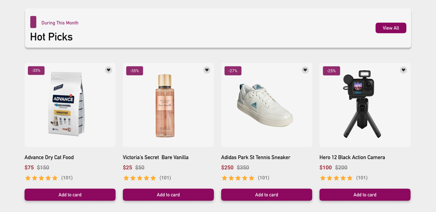
Section 2: Hot Picks
In this section, I used colorful discount tags and product cards to encourage quick decision-making. The card layout shows discount percentages and prices clearly, designed to capture attention and accelerate purchase decisions. Card-based layout is one of the best user experience patterns, as each product has its own space and detailed description. The user-friendly buttons allow users to easily add products to their cart. I maintained visual consistency while using an attention-grabbing color palette to support the design.
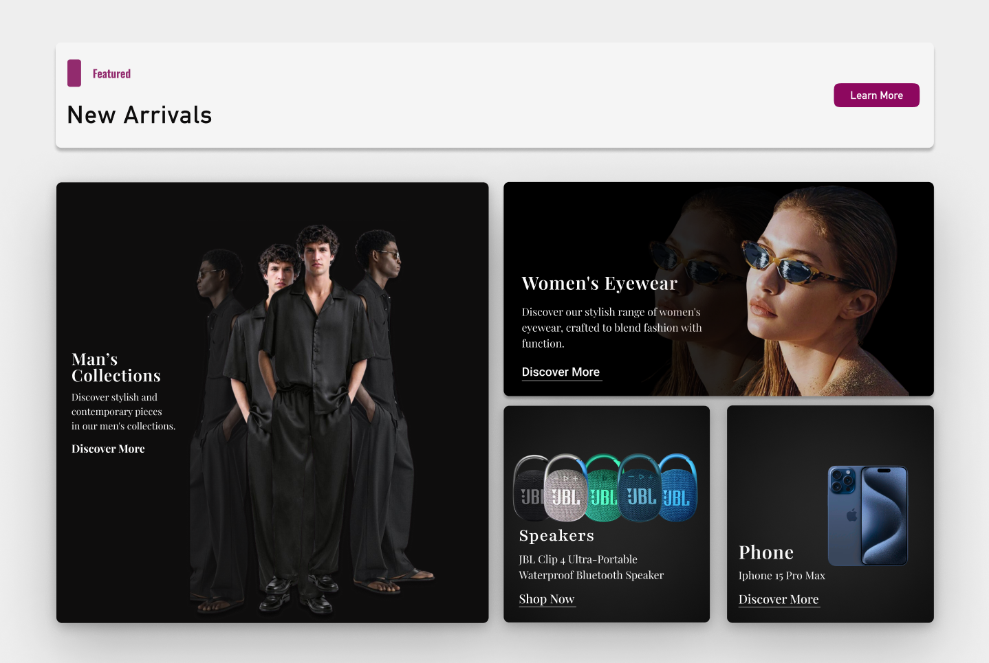
Section 3: New Arrivals
This section features new arrivals with visual hierarchy through large, high-resolution images. Products from different categories (such as men's fashion, women's eyewear collection, and tech products) are organized for easy exploration. The design encourages users to explore without being directed, providing a clear separation between categories. This allows users to effortlessly discover different products, creating a seamless browsing experience.
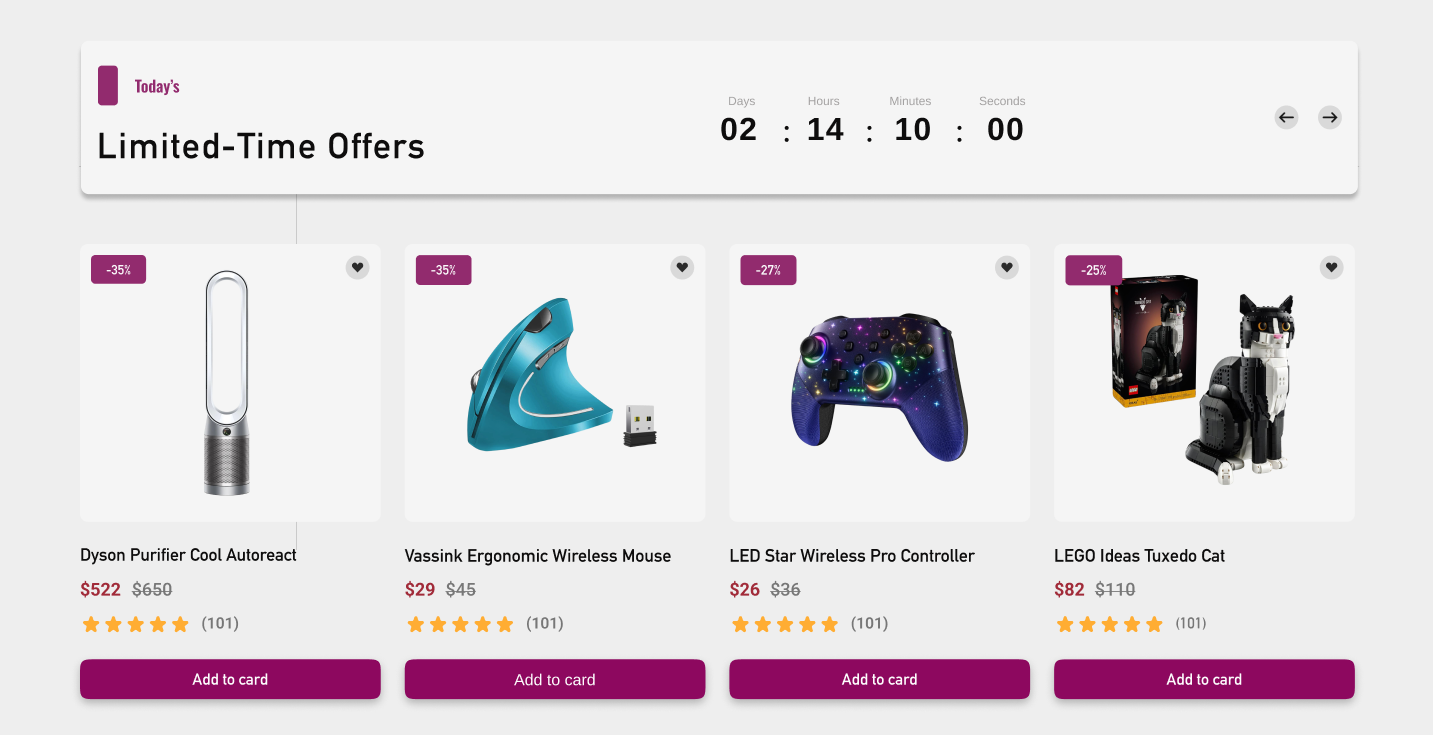
Section 4: Limited-Time Offers
For this section, I added a countdown timer for limited-time offers, creating a sense of urgency and pushing users to make faster decisions. The timer shows how much time is left for the offers, directly prompting users to take action. The call-to-action buttons are placed simply and clearly, enabling users to add products to their carts without delay. As with the rest of the design, simplicity was key here, allowing users to focus on the deals without distraction
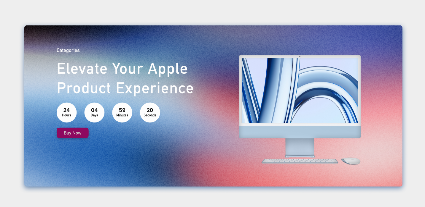
Section 5: Apple Product Experience
This section highlights Apple products with a gradient background to create visual depth. I integrated a countdown timer to emphasize the importance of the promotion period while maintaining a modern aesthetic. The clean and simple design encourages users to explore the campaign further. Prominent buttons allow users to easily engage with the content and take action.
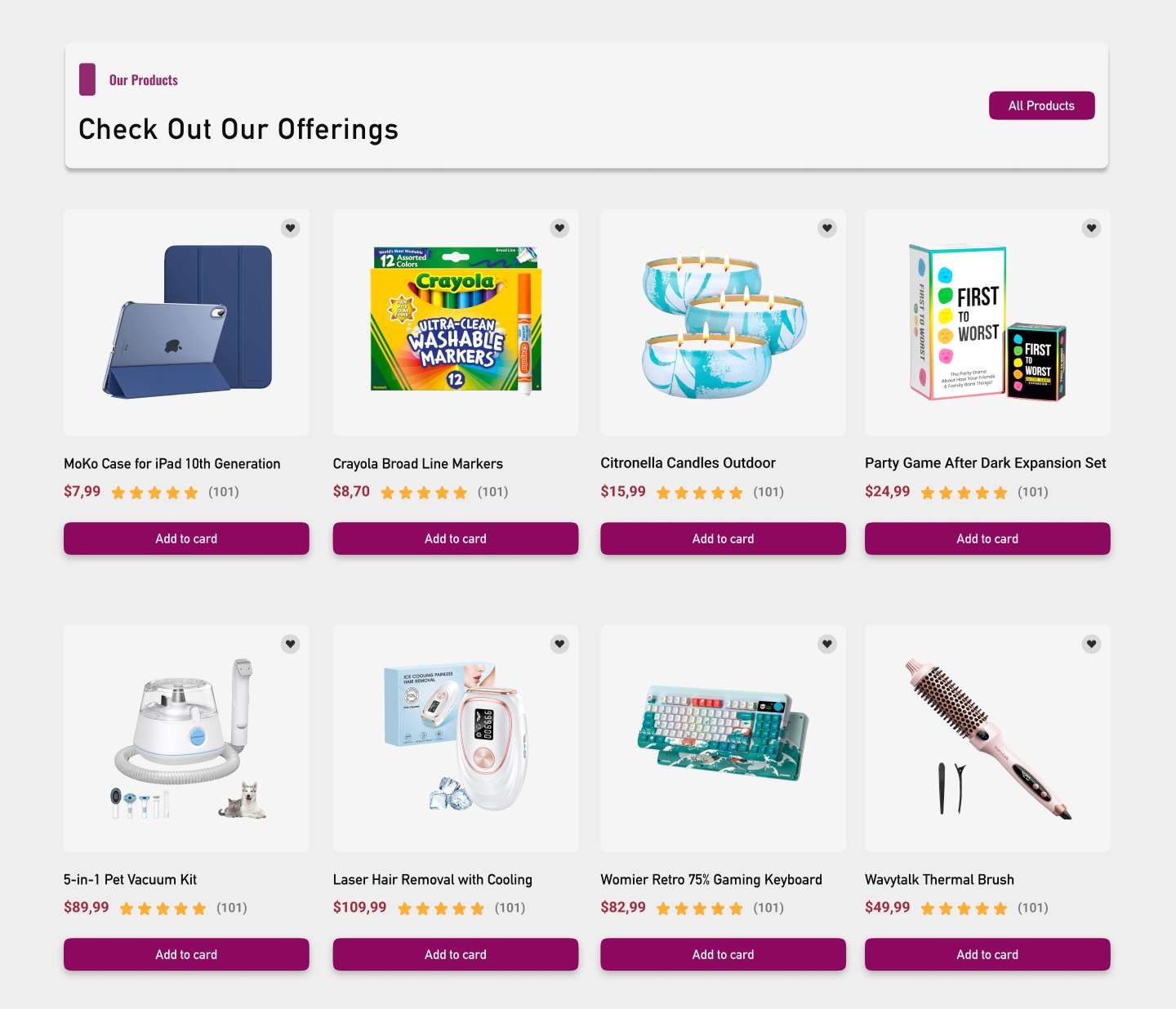
Section 6: Product Listings
This section allows users to quickly view reviews and ratings for popular products through list-based layouts. Each product is presented with detailed evaluations, helping users make more informed decisions. The card-based listing layout makes it easy for users to compare and browse products. User-friendly buttons enable quick and easy purchase decisions, ensuring a smooth experience for the customer.
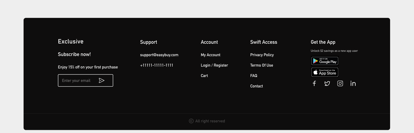
Section 7: Footer
In the footer section, a modern minimalist design was used to provide additional information and facilitate site navigation. Social media links, app download options, and support information are included in this area. The simple background and clean typography ensure users can access the information they need without confusion. App download buttons are prominently displayed, encouraging users to explore the mobile experience.
Conclusion
In this e-commerce homepage design, I focused on applying essential UI/UX principles to ensure a seamless user experience. From clear navigation to visually engaging product displays, every section was crafted to enhance usability while maintaining a modern aesthetic. By incorporating best practices such as card-based layouts, visual hierarchy, and minimalist design, I created a balanced interface that prioritizes both functionality and aesthetics.
Each section of the design guides users effortlessly through their journey, whether they’re browsing new arrivals, exploring limited-time offers, or reviewing popular products. Key elements like countdown timers, eye-catching discount tags, and detailed product reviews provide users with the necessary information to make quick, informed decisions.
Overall, this project represents a blend of simplicity, clarity, and user-centric design, aimed at maximizing user engagement and satisfaction. It showcases my ability to take foundational design principles and apply them effectively to real-world applications, offering a highly functional and visually appealing solution for modern e-commerce needs.